Making It Aesthetic
Hey everyone! Hope you’re all doing well. We’re making steady progress on our Wix website, but today’s challenge? Nailing the vibe.
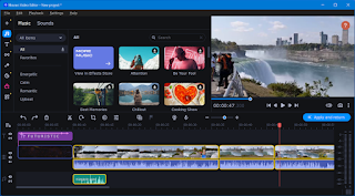
Our film has a moody, cinematic feel, and I want the website to reflect that. Wix has a ton of color palettes, but none of them feel exactly right. So, I’m customizing the theme with deep blues, subtle gradients, and a touch of gold for contrast. Sounds fancy, right? Well, not when you spend an hour adjusting shades only to realize they clash with the background images.
Speaking of backgrounds, I tried using a video loop for the homepage. It looked super cool… until I realized it slowed the site down a lot. Back to the drawing board. Instead, I switched to a high-res image with a subtle animation effect—much smoother and still cinematic.
Font choices were another unexpected struggle. I wanted something bold and modern, but some of the fonts were way too hard to read. After testing a few, I landed on a clean, minimal sans-serif that keeps things stylish but readable.
Even though designing takes longer than expected, I’m really happy with how it’s coming together. Next up: adding a contact form so people can reach out about the film. Let’s hope that part goes smoothly!
- Valentina Agnese


Comments
Post a Comment